After five years of building campaigns and creative for Clarksville Parks & Recreation, it became clear our brand needed more than new visuals — it needed a stronger identity. I developed and presented a brand direction focused on storytelling, clarity, and emotional resonance to help guide the next chapter of how we communicate.
The Challenge
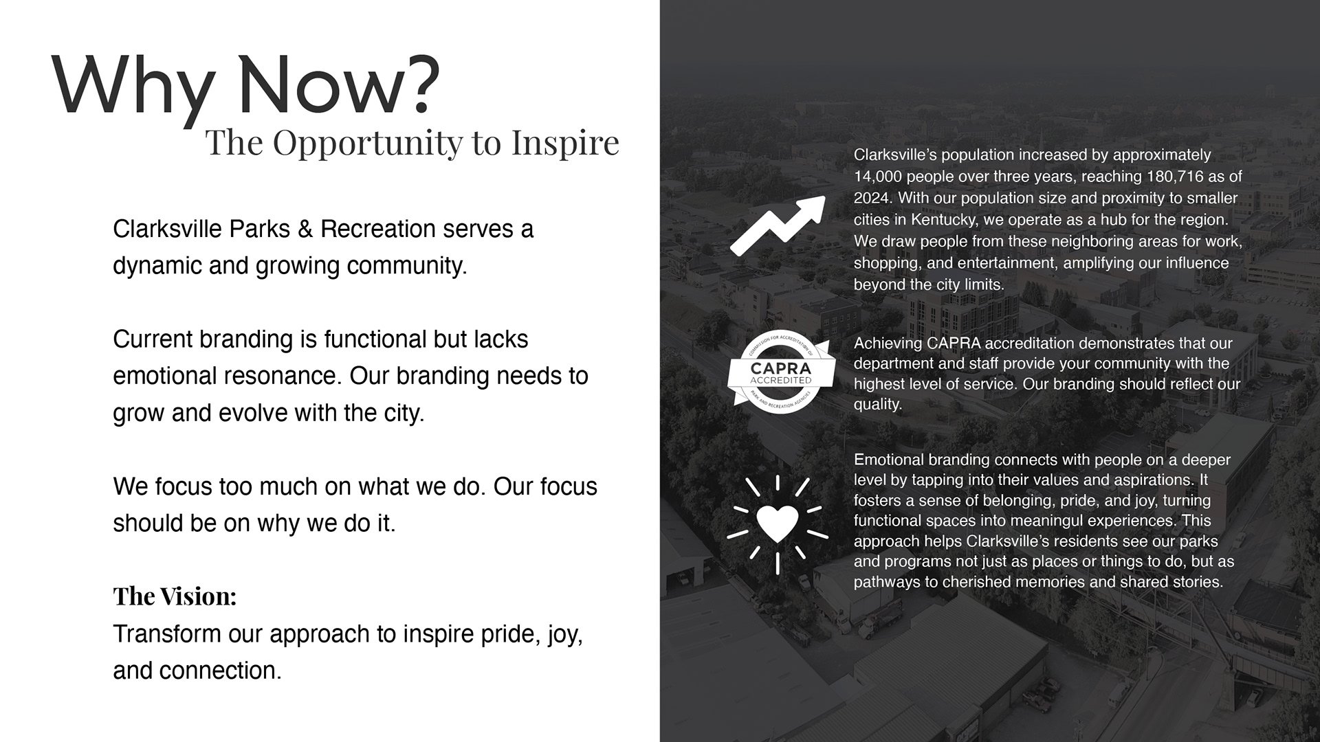
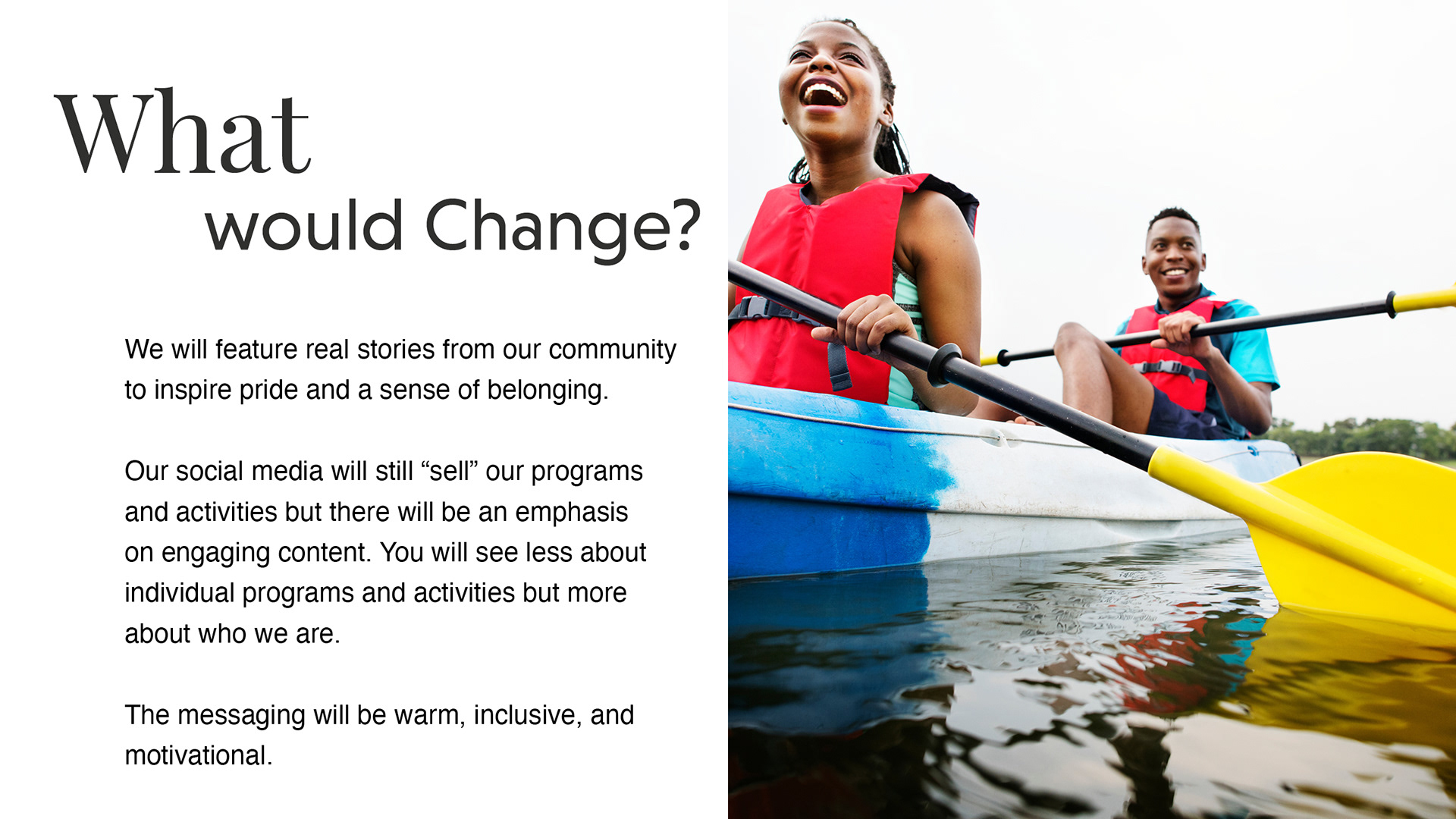
Our department was producing high-quality work, but our visual identity and messaging hadn’t kept pace. The existing brand felt serviceable, functional, but flat. It focused heavily on what we do, and rarely on why it matters.
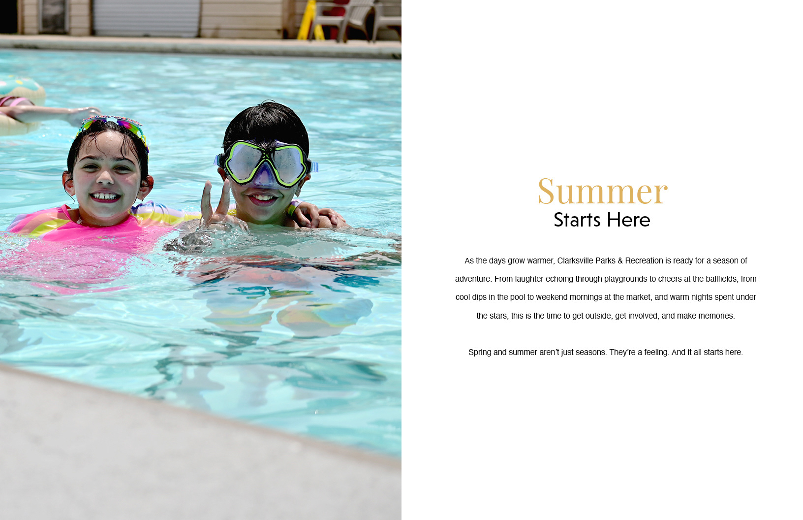
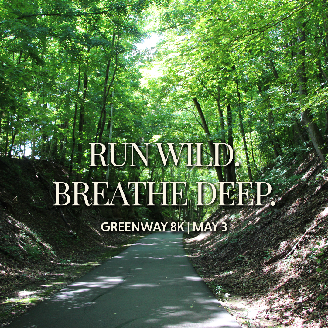
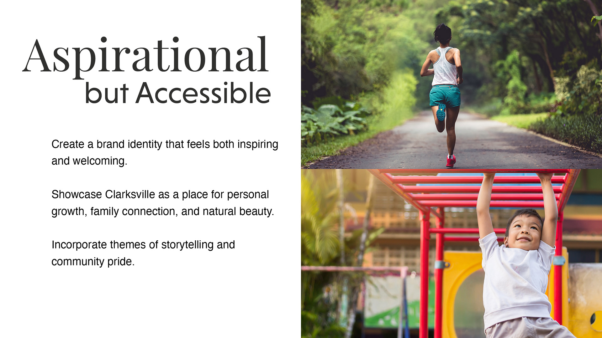
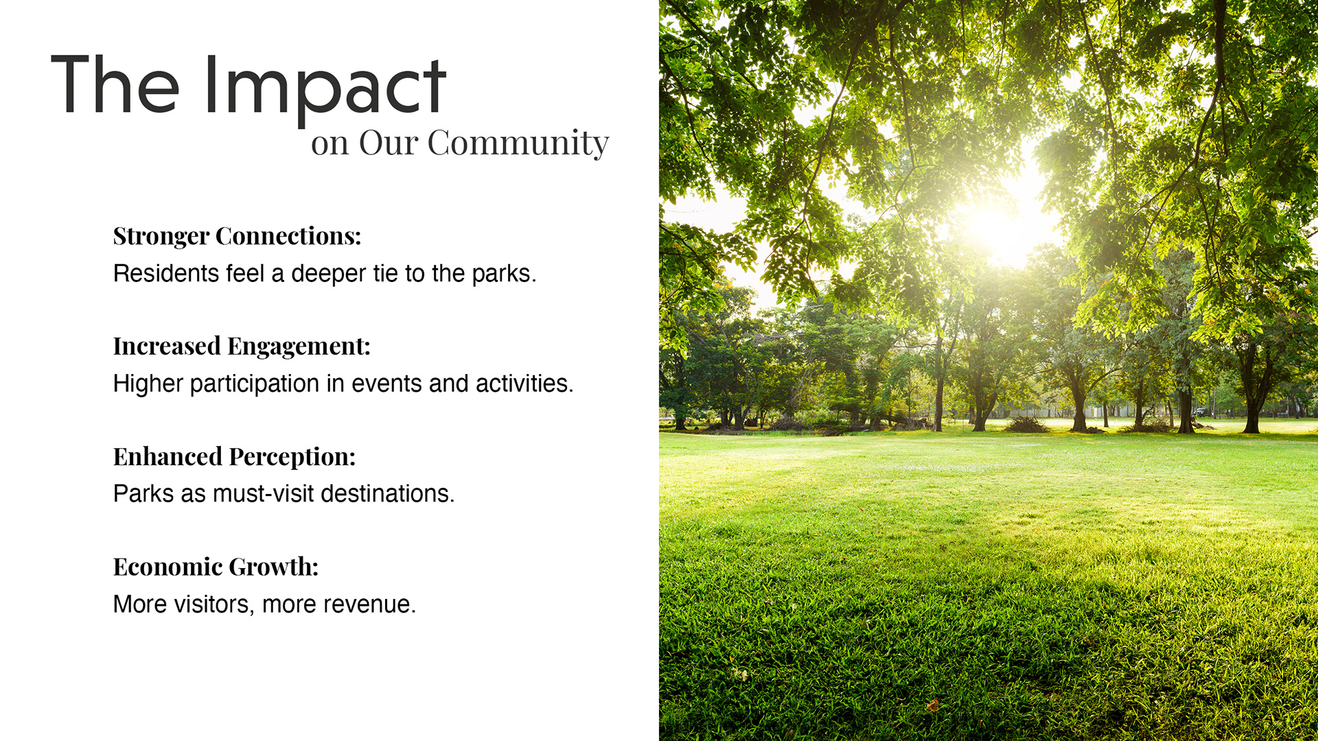
At the same time, Clarksville’s population was growing rapidly, and our parks and programs were reaching more people than ever. We needed a brand that felt aspirational but grounded — one that reflected the pride, joy, and connection people experience through our work.
My Role
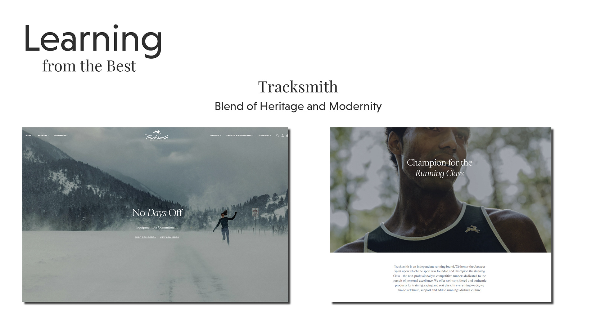
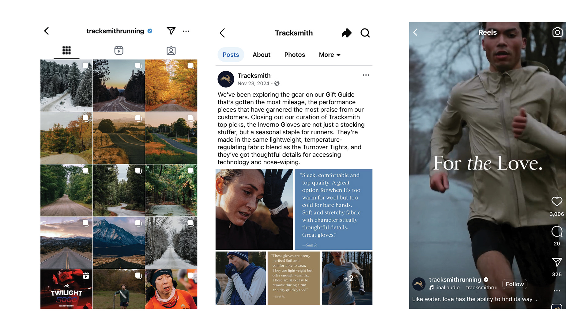
I created and led a brand vision presentation to department leadership to reshape how we tell our story — internally and externally. I developed a phased rollout plan, visual direction, tone of voice guidance, and messaging pillars. I also identified brand examples (like Tracksmith, REI, and Visit Bend) to help leadership visualize what a more emotionally resonant brand could look like in a Parks & Rec context.
While the implementation is ongoing, this work laid the foundation for a more strategic and unified approach to how we communicate across all channels.
The Work
The presentation laid out a vision for how the brand could evolve in both tone and appearance. It started by identifying where our messaging was falling flat, focusing too much on programs and logistics, and not enough on connection, belonging, and community pride.
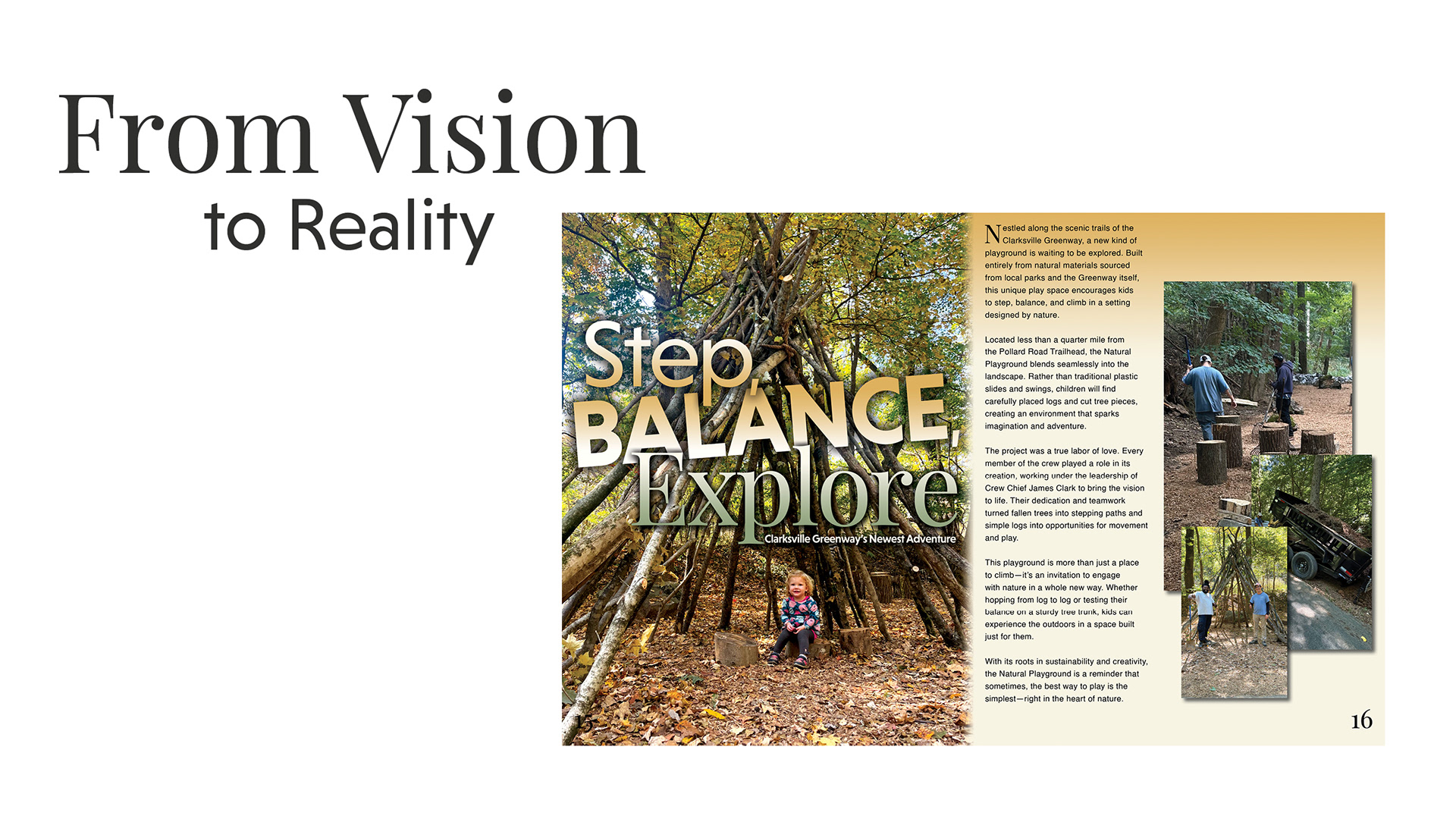
From there, it proposed a shift: a brand rooted in storytelling, guided by emotion, and supported by clean, consistent design. The work introduced a modern typographic system, a focus on real photography, and flexible visual elements that could scale across print, digital, and environmental spaces.
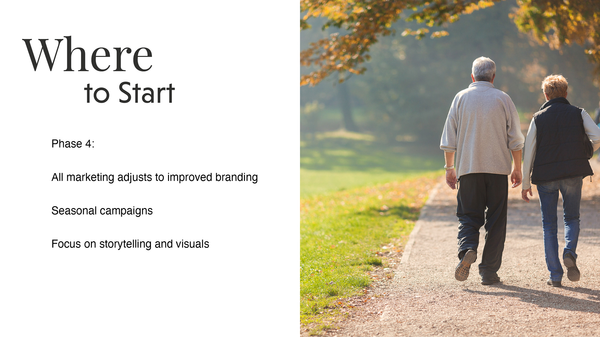
To make the direction feel practical, not abstract, the presentation included example rollouts, a phased implementation plan, and references to other brands that balance clarity and soul. It wasn’t just about looking better. It was about communicating better, with purpose and consistency.
The Outcome
The presentation was very well received by department leadership and validated the need for a more intentional, emotionally grounded brand. We were invited to present the vision to the Parks & Recreation Council Committee, a strong signal of support and momentum behind the shift.
The brand direction also sparked internal alignment. My marketing specialist built on the presentation by developing a companion strategy focused on evolving our social media tone and content. Together, these efforts are helping reshape how our department shows up, visually and verbally, across all platforms.